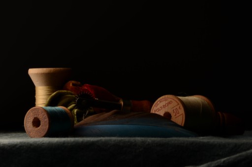
Today's studio photography lecture was on ‘Rembrandt’ light. Teacher couldn't recall the guy's first name (um, Rembrandt...van Rijn, yes?) Also, Rembrandt wasn't really into flowers and still lives, he primarily did people, and more rarely, animals. I have a copy of one of his very few still lifes—a shell. However, Rembrandt lighting is actually a thing. Of course I would've just called it chiasocuro, that being the art history term applied to Rembrandt (& especially Caravaggio's) approach [to] light.
That said, the wikipedia definition notes the classic, defining triangle on the cheek is supposed to be no wider than the eye nor longer than the nose, which I hadn't realized. (I just knew about the shadow going from the nose to the corner of the mouth.)
Studio portraits have passed their heyday, with a lot of people opting to be photographed outside; and though the teacher said that people were ignorant of good studio photography, part of it's simply fashion: folks used to selfies actually get can get used to them to the point that normal studio poses look weird and awkward to them: an argument I had with f2tY when shooting a passport photo, which has very strict rules about positioning.
One sample portrait the teacher showed was a man with touches of turquoise along one side of his face, which contrasted beautifully with his dark skin: the whole thing very much reminded me of one of my favourite paintings, Latrec's At the Moulin Rouge which when I last checked, those flakes at Chicago had taken off display.
This photograph, if it has any painterly forebears at all, I would say would be a cross between Dutch still lifes with a touch of Vermeer. It's a real shame I didn't notice how poorly lit the ponce wheel was until after it was too late to do anything about it. Aubrey the green winged macaw moved out earlier that week, and I picked up one of his feathers on a whim, since it co-ordinated with the blue silk on one of the spools. All in all, I quite like this image, though it's actually only the strobe half the assignment.
Unless otherwise noted, text, image and objects depicted therein copyright 1996--present sylvus tarn.
Sylvus Tarn