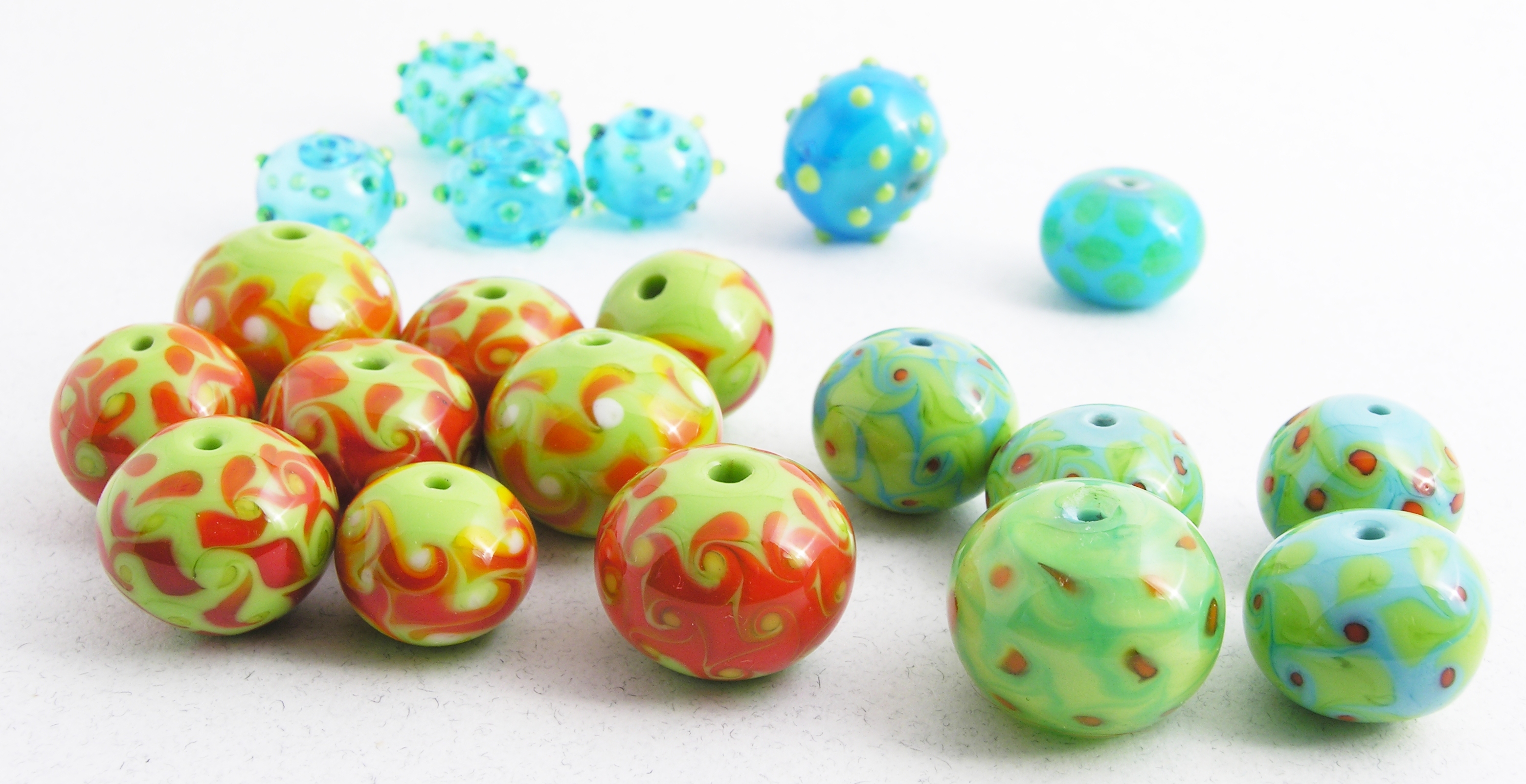
So, once again, my working method: find some cheap or otherwise less-than-perfect glass, in this case a bunch of shorts (very nice shorts, I might add, with hardly any labels on them, and quite long too, six or seven inches) and start with a fun, easy bead. In this case, a dottie on dark aqua base with grass dots. Of course, I'm so out of practice even a lot of these are miserable, so I just cover up the flaws by putting more dots than five around—which in my opinion (and I'm mostly interested in pleasing myself, since they're just for practice) still makes a very nice bead. The reason you don't see those is that by the time I took this photo, I'd already pulled all the failures. So, ok, now I'm making decent dotties. Go me.
from rear left to front right: dotties, a cased dottie, orange on green harlequins,
After awhile it occurs to me I should also practice casing. I thought I'd do the Kristina Logan thing (original? Who, me? Are you kidding?) and case an opaque base bead with transparent and then put dots on it. Oooh, exciting (not). About the kindest thing I can say is it stands up at a nice interesting angle without handi-tac. Ok, let's melt in opaque lime dots on opaque turquoise, then case. With dark trans aqua, so the dots hardly show. Oh boy! Good thing that trans is so dark, since as per usual I'm shoving the base glass all over, not to mention spewing scum (tiny bubbles resulting from boiling my casing glass) all over. Casing and I do not get along and never have. Ok, we've finished with the back row, now onto the next thing.
In orange. I have lots of orange, let's use that. On lime green. Now, there are a great many bead artists who do these these lovely playschool-bright color combos—Heather Trimlett and Patti Cahill immediately spring to mind—but I'm not one of ’em. And doing it as a tessallation (harlequin) does not magically help the color combo, though to be sure the wonky spacing and inconsistant dot sizing don't exactly help matters. And what was I thinking, using white stringer to twist? The yellow, which hardly shows up, is bad enough, but those bland white dots look like pimples. Ugh.
So I switched back to the turquoise, (technically sky blue, but same color family) with lime dots and orange to twist the dots. This is, as I noted yesterday similar to the last successful set of tessellated beads I made, which were lime with orange on grey (which is pretty darn close to blue, visually). Now, my Lani Ching bead is white (or pale grey) and lime (on an invisible dark trans purple base) with cobalt dots,[1] so, however much I've actually failed to come up with something really new, at least her bead and mine now have only one color (the green) rather than two in common.
You can see I practiced casing one of them. Urgh. Have I mentioned how much casing frustrates me? I mean, obviously: I can't even be bothered to get the transparent all the way to the hole (though some miniture tools might help...which by the way, I acquired yesterday. Hm.)
So now I have (so far as I know) a semi-original color combo that aligns with my sensibilities. They're still not great, but definitely an improvement over the orange monstronsities. For the completed beads, I put all these elements together: I cased the opaque turquoise base bead with transparent, used lime tesserae and orange to twist, and also left the lime dots slightly proud. Finally a bead I was pretty happy with. But is it original?
Ah, no.
The color scheme, as I've just explained, plays off an earlier series, and the basic concept comes from another artist. However, what with the texture and casing, I do feel that design is slowly evolving into a look that's particular; obviously, it still has a ways to go before people pick these things up and say, ‘sylvus tarn’; but that's ok, for at this point, I'm not trying for the next great thing, just a decent bead after taking the summer off.
That much, I think I managed. Now if only I could make fun of my writing[2] the way I do my beads, I'd be all set!
photos 08dec09; file created 17dec09, mostly written 18dec09.
[1]And the reason my beads will never be mistaken for hers is that she's got the color morphing from the green to the grey on her tesserae; granted that's in part because Bullseye's opals are much less opaque than Effetre's 200 and 400 series, which together make up the opaque palette, but still. Genius. Gorgeous, too.
[2]In particular, my fiction. Going back to the topic of today's intro (/Archive/20091218.html–can't create links in footnotes, sorry), I discovered to my horror I'd participated on a thread that got cited on Fandom_wank; oh, the hideous embarrassment!
Unless otherwise noted, text, image and objects depicted therein copyright 1996--present sylvus tarn.