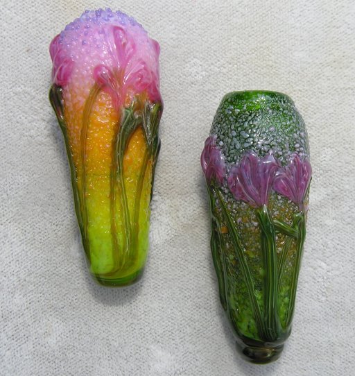
This started out as a ho-hum post about a couple of so-so vessels I made, one of which (on the left) wasn't too bad looking. I'll start by attempting to defend my less than perfect design here: like most soft-glass beadmakers you can take it as read that the Italian 104coe soda-lime glass (Effetre and their recent split-off competition Vetrofond*) are my default, much to the howling dismay of nice folks like Henry Grimmett, who would like to convert me to the joys of boro, (coe ~32) or the good people at Bullseye, another manufacturer of american glass. (coe 90).

Bullseye glass, 2006. Two hollow vessels, perhaps 2” (50mm) long. Handmade floral and leaf cane, premade frit. Photographed 20jul06
—In my view, the second-best reason to use American glass would be environmental rather than patriotic: if the era of cheap energy is indeed ending, then using locally produced goods is just plain common sense. (But of course the first reason for choosing a material is that its qualities suit your goals as an artist.) It would indeed be a pity if all the differing brands of glass worked the same, because it is in their differences that we artists are presented with a wider palette of choices. The problem, of course, are those pesky learning curves.
Bullseye has in my view several strengths, and one of them is the extreme quantity of frit, stringer, and sheet not available to the artist working in Italian, nor indeed any other brand of glass. On the down side, the so-called opals are closer to the Opalino and Alabastro lines—they just aren't as opaque.
That is, when I make frit and floral vessels with effetre, I generally prefer a dark transparent base for my standard version of this bead. (A very bright and cheery variation does use bright opaque colors, but that's a different look, and not what I was shooting for here.) Even though the thompson enamels and frits will cover most of this base, it gives a hint of translucency, particularly the top half of the bead, which is the ‘sky’. In other words, I want a slight sense of depth.
But try that in Bullseye, and you get a mucky mess. (See bead on right.) So I learned to put layers and layers and layers of frit down; then, remembering the old adage about laying down white when airbrushing on dark colors, laid down layers and layers and layers of powdered white Bullseye. And then put down the layers and layers and layers of frit. Beginning to understand why I was getting tired of this? But even with all that messing about powdered white bullseye is not nearly as opaque as the equivalent Thompson enamel, just as the Bullseye opal frits are not nearly as opaque as the equivalent Effetre pastels and specials (the cool and warm opaques series, more-or-less). So I was having to waste a lot of time repeating the same step over and over to get the desired depth of color and it got old fast, even if I didn't have to make my own frits (only a few sizes and colors are available in the 104 palette.)
After I'd made a lot of these graduated frit color vessels as shown on the left (that is, more than five) it finally occurred to me that instead of wishing there was a truly opaque white powder to put over the dark transparent base so the semi-translucent opals don't disappear, that I could just stop fighting the glass and use an opal for the base—the reason for the transparent base initially was to avoid a flat look, which, given the translucency of Bullseye opals isn't a problem. Work with the glass, instead of fighting it... Here I probably chose white or french vanilla, which you can see through near the top of the left vessel. Duh.
As I said, there are learning curves. I'm still learning which bullseye colors do the nasty sulphur thingie. — Lime green and turquoise, unfortunately. But there are some colors you can mix in bullseye, like yellows and pinks, that you can't in effetre, or you get that horrid brown/greyish staining. Now, for some folks that reaction is a feature, not a bug, but its lack in the Bullseye palette is one of its pluses, to my mind.

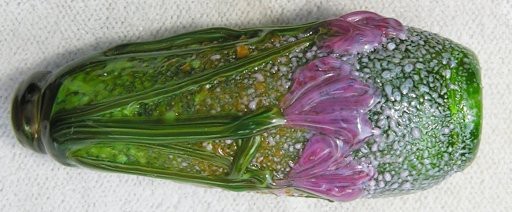
Here I've rotated the bead (for the crop version) and lightened it. Liked it so much I made a bigger version for the post. Bead still has problems (like not enough layers of opaque white powder/colored frit laid down) but at least it's bearable now.
Thus the bead on the left illustrates what I see as some of Bullseye's strengths, and the one on the right its weaknesses (not to mention one of mine, impatience). As a lark I decided to use the less-attractive bead for the index-page thumbnail, on the theory that I could lure unwary folk into reading this so-fascinating post. However, just to make the idea a little more palatable, I decided to lighten the bead up a bit, and lo! it became clear why I even bothered to photograph the initially-ugly bead in the first place—with a little better exposure it still had problems but it was no longer nearly so bad.
Moral of the story: sometimes, if you set the camera up for one bead (or other similarly light'n’bright object) it's not going to do the dark bead justice. Fortunately, there's always the gimp.
file created 26aug06. *Couldn't find a link for the vetrofond people (probably cuz the factory is actually called something different, but google brought up my little wikipedia page on glass beadmaking , and gee, somebody's gone and cleaned it up, added pix, etc. Pretty cool!) Oh, yeah, coe stands for [linear]coefficient of expansion. As a rule, glasses with differing coes do not play together.
Unless otherwise noted, text, image and objects depicted therein copyright 1996--present sylvus tarn.
Sylvus Tarn