Lighting items for photography is still rather hit and miss for me: I often just try things until I get something usable. All of these pictures are taken with a zuiko 50mm prime macro lens mounted on an olympus E620 body, using full manual controls, live view for focus and an all-manual lumo-pro flash that I adjusted manually to get the various light (e.g. power) outputs. As you can see from the angle of the reflections, I actually tilted it up pretty sharply towards the ceiling, with a large black gobo directly between the flash head and the object.
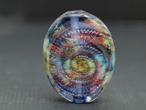
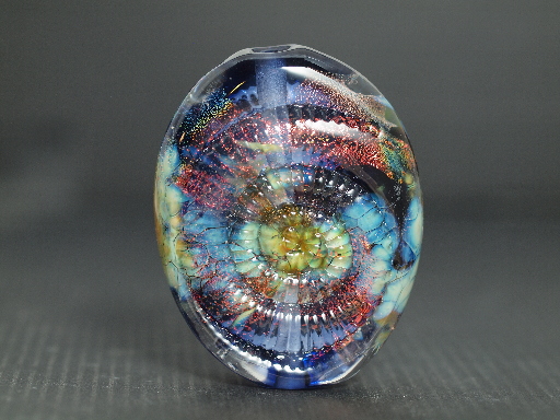
Bead, 2.5–3" high, by Lisa St Martin. Soda-lime glass, dichro, texture pressed. First effort, approx f4, 1/10sec, lumopro flash. Click on any of the images for the fullsize version.
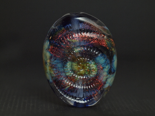
This is another okay image that shows a relatively even balance between the surface (reflection) and the body (transmission) of the bead. N.b. I selected a higher exposure so the image would read well on darker monitors.
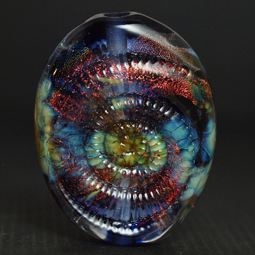
More or less by accident I got more and crisper reflections on the bead. Since Lisa went to all that trouble to put this texture into her bead, I felt this was a better image.[1]
This is on the properly adjusted monitor a better photograph that showcases the dichro more effectively.
And here's the same image with a bit of post-processing. By increasing the light at the upper end (the lightest bits of the image) and decreasing it the lower (darkest parts of the image) I was able to really pop the dichro: note that I did not, at all, have to amp up the chroma or even the overall brightness of the image. This effect was solely achieved with minor tweaks to its greyscale curve. I have to say, after the rotation and cropping tool, the curves tool is my most used. It quickly and easily fixes a lot of problems.
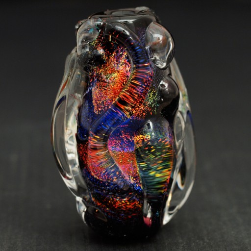
Now that I've got it figured out...Bead is by Lisa St Martin. Soft glass, dichro, trailing. Approximately 2" high.
This is probably the most striking image of the entire series: the clear colourless trailing serves (literally) to magnify and thus emphasize the dichro underneath. Applying the same curves this picture really causes the image to pop. While perhaps not the most technically difficult bead to make, this is the one that screams ‘I'm made of dichroic glass’ (and furthermore, I'm made of red dichroic glass, which along with salmon is the most difficult colour to do well) to me. As a photographer, if I could choose only one picture, this would be it.
On the other hand...
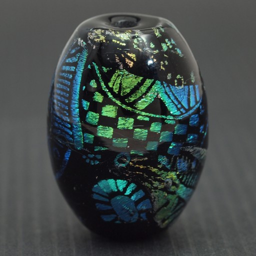
...if I could choose only one dichroic bead for my personal collection, this gorgeous blue and green patterned bead would be my choice. I just love patterns, and this peacock coloured bead is full of them, especially the checkerboards, as well as the simple elegant shape that serves to showcase them. However, I simply couldn't afford all of the Lisa St Martin beads, so this one gets to live in my image collection instead:)
[1]Kristin Perkins, on the other hand, detests any kind of reflections on her work.
Unless otherwise noted, text, image and objects depicted therein copyright 1996--present sylvus tarn.
Sylvus Tarn