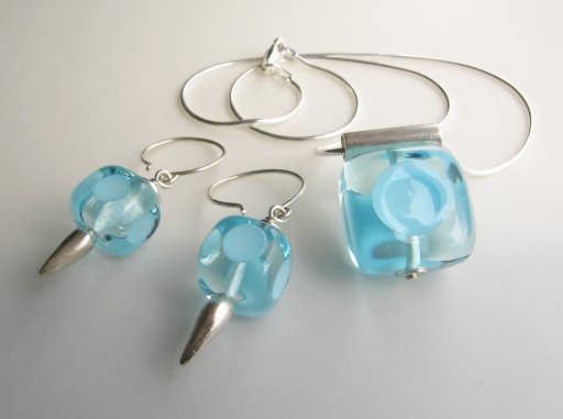
I'm published! —Yes indeedy, my work was published in Art Showcase Magazine. This little magazine showcases local talent in the Washtenaw County area, and I had two, um, items published in the summer 2005 issue, on p.33 of which I'm obviously way too inordinately proud. —Of course, if you check your copy you won't find my name, nor anything like I do on this site. However, you will be treated to these:

Soft glass, sterling silver, lampworked, fabricated. Copyright 2005 Kristin Perkins; all rights reserved. Coolpix8400, 1/42sec, f5/7, +0.7 exp. bias (not quite enough—I had to lighten using GIMP) with a 500w tungsten photoflood, used with camera's settable white balance.
As so often happens when photographing other's work, I get input that jolts me out of my usual ruts. In this case, Kristin wanted to try photographing some of her work on white, rather than the typical black background I used. So we tried it, and I thought the high key worked nicely to highlite the clarity and rich transparent colors so much a part of her working methods; I also felt these pictures showcased her work's elegant simplicity and playfulness.
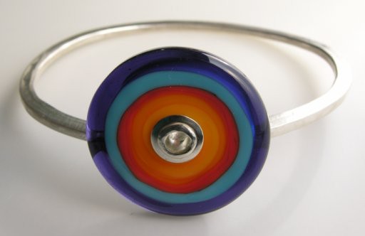
In the bangle below, I know her principal concern was any imperfections in the rivet (photography is infamous for showing the slightest flaw in art jewelry) whereas mine was relief that she uses a glossy, rather than bright-shine surface finish, the latter of which would've reflected the photographer, her equipment and her appallingly messy basement in all its glory...as it is that nice warm pink spot in the center of the rivet is probably my shirt:)

Soft glass, sterling silver, lampworked, fabricated and forged. Copyright 2005 Kristin Perkins; all rights reserved. 1/29sec, f5.7, +0.7 exp bias (again slightly too little)
I found this to be particularly true of this bracelet, for which I was able to reflect enough light that the beautiful ink blue registered as something other than black—it's a handpulled color, too expensive not to show—quite apart from being such a luscious tanzanite blue-violet. I just love the way the light shifts color from a more purple hue, in the lower right, to a cobalt blue, in upper left quadrant of the bead. It makes all the aggravation (in this case, the multiple shadows and their reflections on the white plastic—which I did not really manage to remove—as well as the lack of whiteness underneath it, etc) worthwhile.
Tip: to take down the shine and reflectivity of translucent white plexi, lay a piece of vellum, matte side up, on top.
I have some other stuff in the pipeline, and look forward to showing it off once it debuts in its original publication[s]....
file originally created 14aug05
Unless otherwise noted, text, image and objects depicted therein copyright 1996--present sylvus tarn.
Sylvus Tarn