I'm trying to clear up my dreadful office, and to that end clear out some tasks associated with it, such as the pile up of ephemera, and the need to do some correspondence, such as this little thank you note. I wimped out and just used a Degas ballet dancer blank card for the contents, but as one half of the couple to be thanked is also a multi-media artist, I did at least decorate the back of the envelope (which by the way is from Japan, hence those cute little bow-ties, the end flap & somewhat unusual colour.)
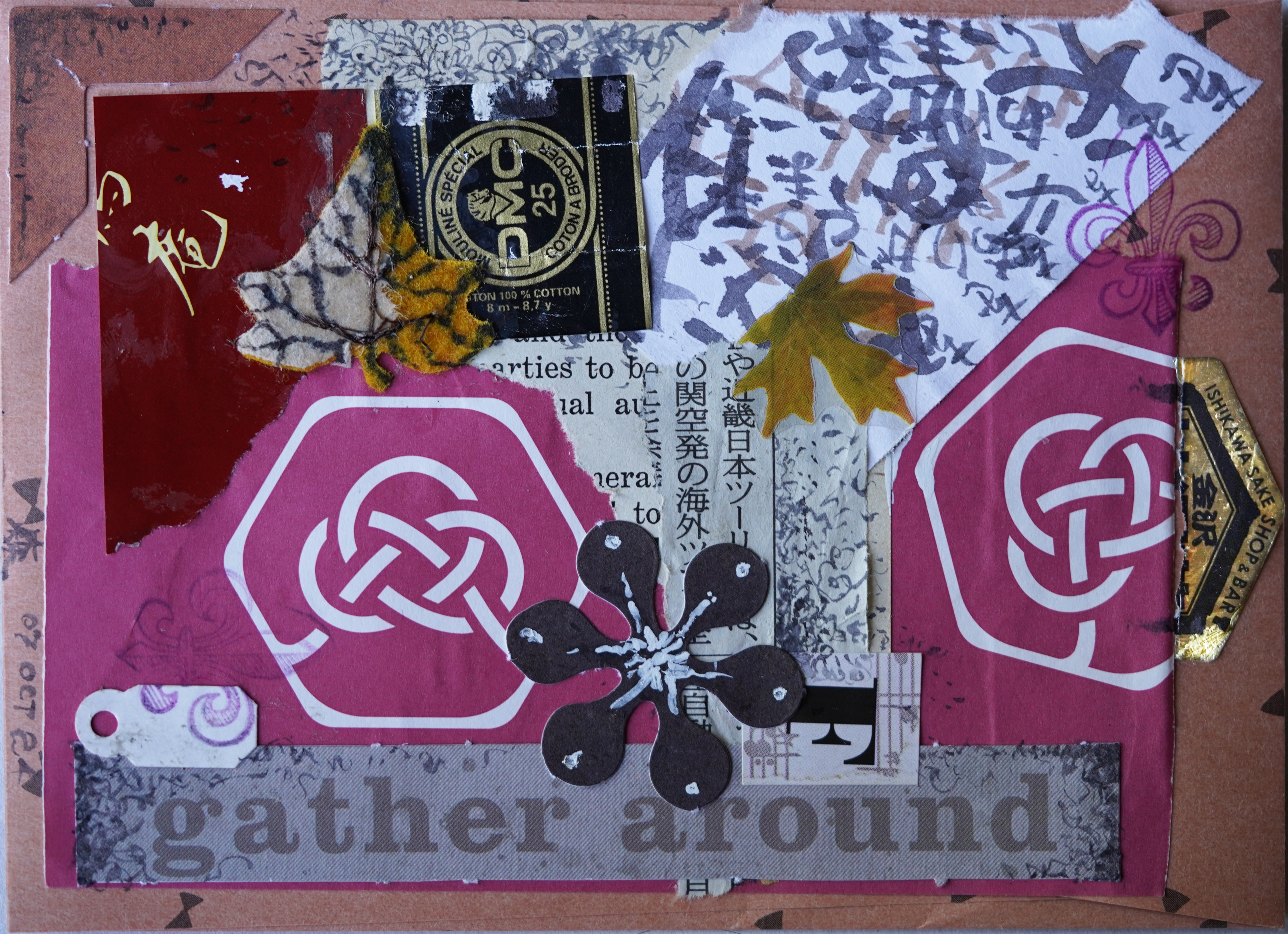
Decorated envelope, roughly 4-1/4 x 5-7/8 inches; US book text and Japanese newsprint, wrapping paper scrap, kanji/shodo practice, embroidery floss bands, assorted product and commercial scrapbooking stickers, scrapbooking die-cut elements, tag, assorted inks, elmers’ glue. 7 & 8 oct 2024; photographed, sony ILCE-7C w sony 90mm macro lens, ISO 500, ev +1.0, 1/100s, WB: shade; squared up w unified transform tool, cropped, lightened & scaled to 4000 pixels in gimp
Though it's hard to tell looking at the finished product I started with the printed text; the difficulty was that I liked the interlaced knots in the hexes on the wrapping paper so much I didn't really want to cover them up, which added considerably to my difficulties creating a unified design. I also decided I wanted to use some of the various scrapbooking supplies a sib gave me, and making them not look too...artificial? inauthentic? too I-bought-this-premade-stuff-at-a-craft-store-instead-of-gathering-ephemera-actually-special-to-me anyway can be rather frustrating. Yet I do like items with transparency, (such as the smaller maple leaf) ones with interesting texture (such as the larger felt maple leaf) or interesting shapes (like the 60s flower) and even the blurb felt appropriate—it was a party after all, and people did tend to congregate in rough circles.
The “calligraphy” is leftover from practising 日本語 on Duolingo, and as I couldn't find any technical pens amongst the mess on my desk, the doodles were added with the same brush pen and diluted ink from an Italian callig kit[1] that it wouldn't surprise me to discover was as old as I am—at any rate the cork stopper for the ‘negro’ ink had long since rotted, though in washing out the cute little bottle I was able to somewhat resuscitate the ink, which I'm using for practise.
Which is why the doodles are grey rather than the usual black.
But actually the bit I'm proudest of is the post-production: I lightened up the two gold metallic labels so they would read correctly, and was able to do so relatively quickly and painlessly. Probably in another 20 years I'll be half way good at gimp:)
In the meantime, here's hoping the recipients enjoy this little piece of postcard sized “art”.
[1]Somebody gave me this thing, clearly a declutter, but I can't help wondering how many years—probably decades—it sat first. The indigo ink also included was in better shape, though it had turned brown! As you can see in the shodo practise in the upper right corner.
Unless otherwise noted, text, image and objects depicted therein copyright 1996--present sylvus tarn.