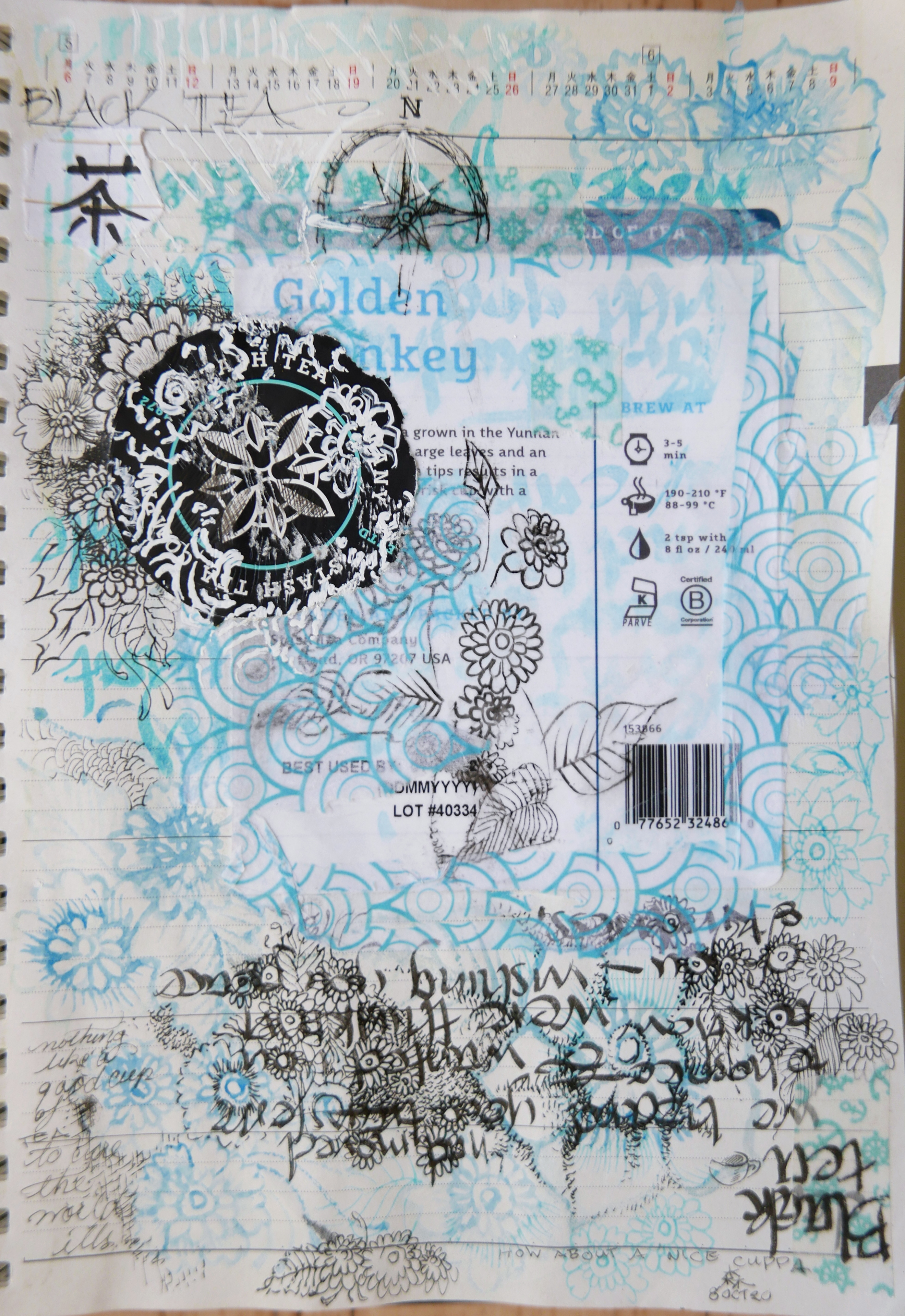
Tea is an important part of my life, and I have many fond associations with it, so since I was able to successfully remove a label from a bag of loose black tea, I pasted it into my sketchbook, over which I drew and calligraphed—mostly the henna inspired flowers that have been dominating my iconography this year.
Japanese sketchbook, 8.25 x 5.5 inches, label, cardboard, ink, marker, paint pen (white), watercolour, washi tape, tissue paper, glue. Photographed 08Oct20 (& completed either that day, or earlier that week.)
But though the back of the label was paper and adhered readily, the front was slick, and some of the ink smeared, so the project sat for awhile, because I wasn't happy with the effect. (Note that this is different from saying the smearing was actively bad.)
In the meantime, Fran, my ‘glass daughter’, had sent me some tissue paper printed in concentric aqua blue circles, somewhat reminiscent of a watery fish-scale pattern. This stuff is somewhat translucent, which meant I could layer it over the smears. I also finished off a box of individually wrapped tea bags which had an aqua element.
The brand of tea we buy—Stash—uses a compass rose as part of its logo, and as a former sailor I appreciate this. Combined with the paper from fran and some washi tape—practically the very first I purchased (because it was cheap) of anchors and captain's wheels, I now had an effective way to cover up the smears, and combine a number of elements that were both visually related by the color and thematically by iconography (tea; the sea).
Of course, the mostly black logo would have been too dominant in the design without some blending, which I first tried to do by etching with a the point of a compass. Scratching didn't work nearly as effectively as I wanted, so I got out a white paint marker (also a gift from Fran) as well as cross-hatching parts of the rose with microns (in black). Now the addition served as an effective focal point but still seemed joined to the rest of the piece.
Originally I was going to do the calligraphy for ko-cha —black tea—but I was having a hard enough time with the simpler, second kanji (which when by itself generally refers to green tea, that being the default in Japan, just as black tea is here). I made several versions, but this first one was the most natural one, so that's the one I used.
This page faces the goldfish and I think they pair reasonably well.
Unless otherwise noted, text, image and objects depicted therein copyright 1996--present sylvus tarn.