Jen McCreight of Blag Hag recently put forth a call for a new, improved sort of atheism; more inclusive of women, PoC, gay and transfolk, etc. Well, like so many others, I think it's time and past for those sorts of social justice issues to become an important part of the movement.
And of course, people felt it ought to have a new logo to go with the new name. There's nothing wrong with the logos shown, but I didn't like them—probably because I happen to like making a particular sort of calligraphic capital A that I thought could be adapted perfectly to this logo.[1]
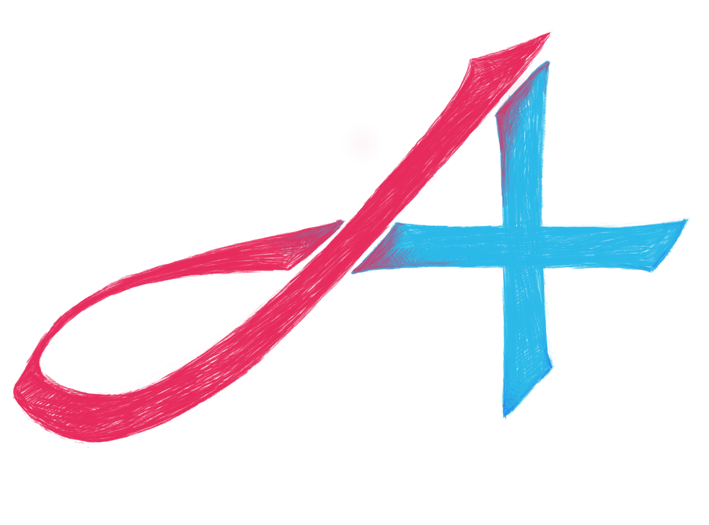
So what I like about this concept is that it:
My effort.
- is reminiscent of the original (i.e. used by FTBlogs)
- gracefully incorporated the plus into the A glyph (i.e. can read just as A)
- plus was a major component (doesn't look like an afterthought)
- though shown in two colors, could also work as b&w line art
- would be legible/identifiable at very small sizes
- has a bit of ‘human’ looseness to it[2]
To be sure, that last part comes more out of my total suckage with inskcape or any other kind of vector tool.[3] In fact, I used three different graphics programs in attempting this. After taking forever to remember that the bitmap to vector tool (potrace) is part of inskcape, rather than gimp, and then discovering (yet again) how bad I am with vectors, I tried creating the bulk of the thing with inskcape's shapes. Or maybe it was krita's. At any rate, I discovered my original sketch a lot of subtle curves in it (by the way, good fonts do too, but they're usually not obvious unless you're into typography, and sometimes not even then. Ahem.) so assembling it using, say, rectangles even for the obstensibly straight parts stiffened the life right out of the design.
So I finally photographed the sketch, imported it into gimp, cleaned it up and deleted the background; then, after some false starts with filters in gimp, decided I'd have to draw trace[4] it from scratch to get the look I wanted. So I loaded the file into krita (which has much better tablet support and brushes, not to mention tilt), traced it in the two colors using the 2B & chalk brushes, asked f2tE to critique it (the ends of the plus needed more definition, ze said) added a bit of navy to do that...and voila.
I wanted a true scarlet for the red, but couldn't really get what I visualized; but I was thinking of the Scarlet Letter (I mean, this whole brouhaha is over feminism, right? So that seemed appropriate, given the original bright red A). I picked turquoise, rather than navy, to go with, because it seemed to me that a lot of prominent atheists in this movement are either US/UK, and I wanted something that wasn't so suggestive of those countries’ flags.
I still think the loop could be a little more graceful—more horizontal, mebbe; but I'm pretty happy with it. That said, the plus might be a little too strongly incorporated, so even if it hadn't taken me two days to translate an idea that I should've been able to whip out in 20 or 45 minutes, it still wouldn't have been most people's pick.
But I sent it off to Jen McCreight anyway; and posted it here, for anyone in the ‘Atheism plus’ to use if they would like.
[1]I mean, it would be sad if I didn't like my own idea best, right?
[2]because, you know, atheists have this rep for being cold, rational, and thus inhumane people, and we're really not—no matter how much we try to tell the world, and ourselves the contrary...
[3]Obviously there could be a vector version of this thing; just not one made in immediate future by me;)
[4]Tracing doesn't count when you're tracing your*self*.
Unless otherwise noted, text, image and objects depicted therein copyright 1996--present sylvus tarn.