The initial response to my first batch of beads was fairly positive, but the customer mentioned a preference for white. Which I admit to flummoxing me just a tiny bit, because although some users of Thompson Enamels swear by the stuff—I think Jennifer Geldard uses more white than anything else, and of course the low numbered whites are essential to Rene Roberts’ working methods—I could probably count on the fingers of one hand the number of times I've used white. (Well, that's just a tiny exaggeration: I think the lavender mo[u]rning beads use white, but aside from those and the limited edition series of 9/11 beads I can't think of any other times I've regularly used white in my abstract designs.)
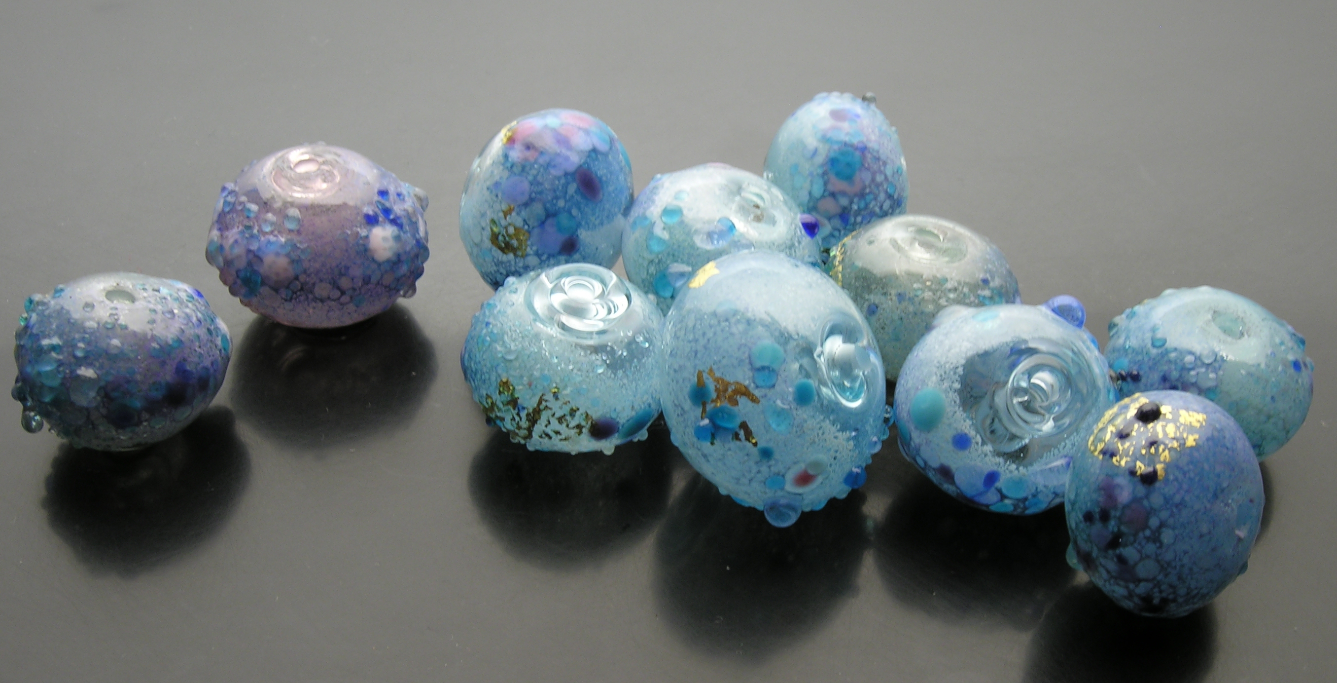
The 2 beads on the left are more purple (whoopsie!) and the two lightest beads from the previous series are shown on the right. Frit and powder chiming abstracts with white undercoating, thompson enamels, artist-made frits, gold leaf, largest 20x24mm. 25nov07.
Time for me to learn, obviously. I wanted to give the beads a little zip (hueistic contrast) so I tried substituting pale pink frit for violet. Eventually I went back to the purple, but overall I was rather surprised at how readily the white and turquoise blues blended: Jennifer Geldard gets quite a speckly effect when mixing white and cobalt (dark) blue, and so I expected the same thing to happen here.
Nevertheless, I note that I had to check the old beads for dark blue goldstone flecks to tell the last batch from this. One obvious experiment would be attempt a bead that combines aspects of both lots. But it's getting late, so that's for another day.
file created 26nov, from photos taken 26nov, from beads made 25 nov...
Unless otherwise noted, text, image and objects depicted therein copyright 1996--present sylvus tarn.