This series of beads came out of a customer request for beads similar to those featured in Stringing Style, which was a collection of favorite projects from Beadwork magazine, plus some new designs. My beads were part of a simple multi-strand necklace of bali liquid silver like beads accented with three of my abstracts, 2 medium and one large, used as the central focus of the necklace. As it happens the beads depicted in this project are somewhat atypical, in that they came out of a series designed to use up (of course) some very dark, fine purple frit.
Which, of course, I no longer have.

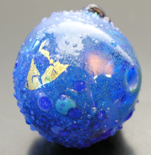
hollow chiming abstract built in 3/32” mandrel with a hand-pulled greasy dark aquamarine base. Gold leaf, white and assorted blue TE, custom violet-blue frit, transparent fine aqua frit, and blue goldstone frit. 20x24mm, 17nov07 (N.b.: this bead is backlit more than ordinary, owing to shading the lightsource with a flag, rather than a diffuser; thus the transparent base, rather than the surface colors, is emphasized. See below for more typical lighting.)
I figure anyone who goes to the bother of emailing me directly to place orders for beads (as opposed to purchasing them at a show, or shop) deserves something a little special, so I made the first test bead on some hand-pulled aqua that has a slightly greasy appearance in the rod. However, the bead looks as if made from typical effetre dark transparent aqua. Since the customer requested something more blue than violet, I emphasized this by putting a bunch of colors typically considered ‘blue’ on the bead.
The problem with this approach is that just because a color is called something-something blue in English doesn't mean it blends well with other something-something blues. Often this can work if one likes mixing analogous (next to each other on the color wheel) colors, but in this case, my first test bead seemed to me not particularly gelled in terms of color. The white seemed a bit harsh, especially since the blue goldstone, instead of being subtle blue sparklies, merely reads as black. It makes the bead too contrasty, without enough transition in its color scheme.
In short, I felt the base glass overpowered the surface treatments, which is not altogether surprising, since I tend to use relatively subtle base hues (i.e. tints) for thse beads. Paradoxically, the way to downcheck the purple is start with it: so I started with a pale lavender equator roll, with proximal patches of sky blue, then distal patches of grey green (since the beads in the books were less intensely colored than my typical blue and purple abstracts with final touches of purple and cobalt. Then I followed with coarse periwinkle/violet-blue/turq opq frit, gold leaf, coarse pale transparent violets, and finally fine transparent aqua and cobalt blue frit.
So far, so good.
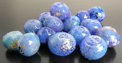
Then my customer emailed me, wanting to know about the beads, and school let out for the Thanksgiving holiday, giving me a nice long block of time to do a second batch, which I documented much more sketchily. The goal, however, was to soften the intensity of the colors, as the beads featured in Stringing Style are somewhat less saturated in hue than is typical. I used much the same colors, but added a grey transparent frit to the mix. Then I carefully shot both lots of beads, preparatory to making this post...and naturally put all the beads in the same tray once I finish photographing them.
And promptly discovered I couldn't distinguish the two lots. At that point I'd spent several hours (or so it seemed) photographing and writing this post and had run out of time to work on it. But it points up something I find interesting which is that even after working with these colors and materials for years, I still often over or underestimate how similar one set of abstracts is going to be.
But at least the beads are pretty.
Unless otherwise noted, text, image and objects depicted therein copyright 1996--present sylvus tarn.
Sylvus Tarn