In my last post I blathered a good deal about how my inadequacies of understanding with regard to Bullseye glass's working characterics caused me no end of irritation. But this post is really more a continuation of the ruminations from awhile back, because I cannot seemed to stay focused on any one topic for about more than two–three days. (My all time record is about three months. That happened when I was writing a novel.) As I mentioned last time, bullseye pinks and purples will play nicely with yellows and oranges.
—I suspect that bullseye pinks and purples might even play with french vanilla, which is the closest thing the BE line has to ivory; and, as it happens Effetre doesn't currently have any dark pinks or purples comparable to 301 pink, 305 salmon pink or 334 gold purple, so whether they'd mix with the yellows and yellow oranges is actually something of a moot point (at least, currently. All this competition means everybody keeps churning out new colors, goody for us:) —I take that back: 254 EDP is a very nice pink, and occasionally quite pretty purple, depending upon its mood and your flame chemistry. I have my suspicions, though, about its behavior with regard to mustards and the like; but that's a subjecct for a future post.
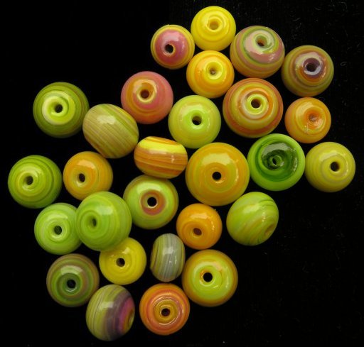
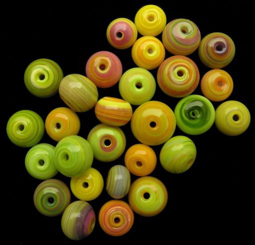
The point is that I added purple and pink to the yellows, oranges and greens I used to make the last batch of mini-stripeys, and was fairly pleased the with result, which I show below...
...heavily image processed. This was something of a lark on my part. Ideally, highlights and shadows should be even and regular, so as not to distract from the subjects. Unfortunately, no matter how many times I see trees, the camera, the photographer, etc etc reflected in pictures of beads I take outdoors on cloudy days, hope springs eternal that I can just quick'n’easy set ’em up on a table and snap a quickie without having to mess with lights, backgrounds, mounting the camera on a tripod or copystand etc.
Serious photographers have always put as much if not more hours in the darkroom, after the shutter has closed, than they have setting up shots, even studio shots. With the advent of digital photography, post-processing, as the time put in to adjust the image after it's captured is called, has really come of age. Because the original is always available to screw up again, not to mention the infinitely greater power of the processing tools (which allow for, among other things, incremental and reversable screwups), the lure of perfection (or at least the opportunity of rescue) is very strong.
Not only that, the line between capture and post-processing has become increasingly blurred, as camera manufacturers scramble to provide ever more ‘on-the-fly’ adjustments in their equipment. In fact, in reading serious photography sites, the attitude is pretty much that post-processing skills are just as critical as the picture taking skills. In the old days, of course, when people sent their stuff out to be photographed, the photographers (presumeably) had professional standards that delineated the barrier between say, ‘clean-up’ and ‘minor fixes’ let alone ‘minor fixes’ and ‘fraud’.
Nowadays, though, any fool with a computer can play this game.
I admit, I've rather been waiting to see where the lines are going to be drawn for jury slides, as we go more and more to digital models. (Bruce Baker said a year ago that in 5 years all art fairs would be going that route—10 at the most, I'd say. It's just so much easier and cheaper for everyone involved, and you know they'd love to widen their profit margins on those $25 jury fees. You can bet they're not gonna reduce ’em, that's fer sure...) But in the meantime, I've been fiddling with the images I post on this site, mostly because it's a low-stress environment, with just enough of a prod (I need a web page—and let's dress it up a little) that I'll spend a few minutes, usually adjusting exposure, on the pix in this site.
But about the time I took the Bruce Baker lecture, I also started ever so slightly more post-processing. These images, however, are the first ones for which I've bent the processing in service of making the product, as opposed to the photograph, look better. This, to me, is the dividing line (unless, of course, you a) state up front what you've done and, even more important, b) provide the original.

Half and half. Processed on the left, un on the right. I cropped the images slightly differently, hence the minor mismatch, which does at least have the advantage of showing the where the dividing line is.
So, in my view using the curves tool to adjust exposure, or even going to far as to combine the images with differing exposures to get one that looks good all over (some cameras, including my own, can be set to take multiple exposures at once; how is that different than going into the RAW data and adjusting the brightness manually?) because these tools do not target a specific part of the subject. However, careful examination will reveal that I've made major use of the stamping tool, not only to smooth highlights or even to disguise the hairs, poorly removed bead release and other dirt, but also minor flaws in the beads. I even tried giving one badly made bead a ‘dimpled’ hole, though my gimping skills aren't quite up making that entirely convincing. (The topmost bead just left of center, with the large pink area near the hole.)
Ironically enough, because my technique is still weak, I think the edited images are missing some liveliness of color. But judge for yourself. —In any event, I doubt this is going to be a huge hairy problem in the art-glass bead world, simply because we've not got enough money to make it worthwhile. (As an example, I spent 4–5 hours on this image, and only the fact that I was ‘practicing’ could justify that expenditure of time. Usually I don't spend more than 5–10 minutes, if that, prepping an image for the site.) I have no doubt a few unscrupulous people will take advantage of the technology to distort the beads they're selling; I'll even to concede that some of them will be bead artists, though I haven't actually met all that many with the necessary trifecta (isn't that a cool word?) of skills—lampworking, photography and image processing.
Unfortunately, it's more of a concern in the real world, and, in my view, particularly problematic for people—women especially—with body image issues. There do, however, seem to be some signs, however stumbling, of a backlash against all this perfection; and sf fan that I am, I have no doubt that the currently crude tools for sculpting our bodies will continue to evolve, and, it's hoped, become both safer and cheaper for those who desire such things. I am not, however, so foolish to believe that rich and poor will become indistinguishable at first glance, though I've fond wishes that class markers (at least amongst people with taste) will shrink. —One can hope, anyway.
Not to mention the political frauds, though those at least are decried, when discovered, as opposed to de rigeur for any woman's mag cover model. (One is bad, the other required. Cognitive dissonance, anyone?) In the meantime, others have given the problems inherent in easy imaging (taking and making) a good deal more thought than I.
file created 27aug06. Finally, for those who just want a couple of tips (bearing in mind that my efforts at post-processing are roughly equivalent to those of a hollow bead maker with a bubble and string-cutter ends into the bargain): I've found that selecting a round fuzzy brush for the stamp tool helps to blend; also, on top of that, the transparency of the stamp can also be changed from 0–100%. Just as you change your flame, don't hesitate to change brush size and transparency. Oh, and get up close and personal. Sometimes I magnified the image to the pont where I could easily see individual pixels.
Unless otherwise noted, text, image and objects depicted therein copyright 1996--present sylvus tarn.
Sylvus Tarn
