So awhile back, perhaps impelled by the many odd pieces of bullseye cluttering my life, I decided to make some dichro focals. I like making big gaudy dichro focals, but I'm still attempting to find a distinctive way to make these beads. They don't look especially particular to me. (I know, if I really cared, I'd sign my beads, right?) I've experimented a little with trailing, especially clumps of tapering-sized dots, and a few curliQ type swirls.
But then I failed to photograph the first bead in the series, which was, I believe, this one. Now it's been so long I no longer remember what order I made the beads in, so it's a moot point, except I was hoping to write a series of posts explaining how my ideas developed over time. Ooopsie.

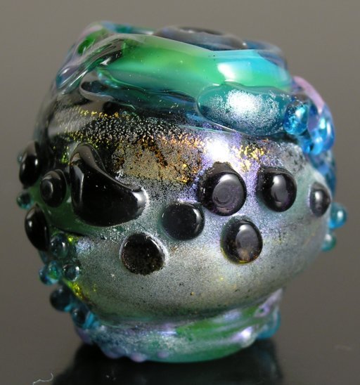
dichro focal, fall? 2006. I can't find my caliper, but this thing is roughly an inch (25mm) high. Yes, it's hollow.
So why am I wasting your time with this fugliness? Well, the hope is that you can learn from my mistakes (somebody oughta profit from them besides just me, surely?) That way, you can get on with making new, fresh mistakes, which is ever so much more productive. And, yes, writing about this does actually force me to understand why the bead is so bad. Well, here are some obvious pointers: don't fry the pixie dust. Or the dichro (upper right edge of the strip). And don't use glass so dark that the dots read as black: Bullseye has two very dark transparent rich purples, but one, transparent gold purple, (1334) makes much prettier dots that read as a lovely saturated purple than the other deep royal purple (1128) which is too dark and not as vibrantly colored.
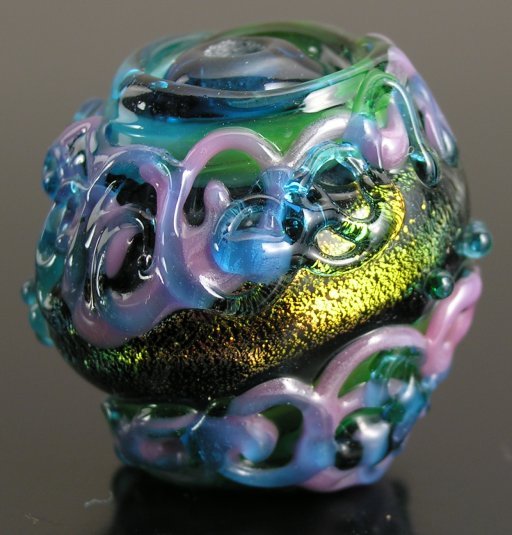
This side at least is technically ok—nothing scorched and the colors all read reasonably well. Well, except for the chill marks on the one dot. But I find (visually) mixing opaques and transparents in a way that give layers of rich, subtle colors very challenging. Um, that's the word I want. Challenging. As opposed to really hard, and beyond my abilities. (I've been messing with color for twenty-plus years now, I should have it down, right?) Also, if there are going to be multiple layers, subtly interacting with each other, then they have to overlay each other, not stop at sharp boundaries, as I did to keep the curliQs from covering up the dichro.
By trying to ‘save’ the beauty of the dichro, I ruined the overall look of the bead. The bead does at least manage to stand upright on its own, and I made it without breaking the release, so the holes are decent, and it's not cracked.
That's something I suppose. Tune in next time for ever greater fugliness.
file created 19nov, slightly updated 28nov.
Unless otherwise noted, text, image and objects depicted therein copyright 1996--present sylvus tarn.
Sylvus Tarn