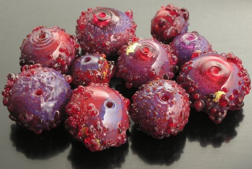
By now you should be getting the idea that the way I livened up obstensibly green, blue or red beads was to introduce analogous colors to the mix. After green, purple is probably my favorite, so I snuck it into both the blue and these red beads.
Frankly, I didn't feel I had a whole lot of options. The customer wanted red but no orange. I understand this sentiment perfectly, cuz my partner is another one of those “no-orange” folks, though long association with yours truly has softened her position. Unfortunately, Thompson enamels has only two reds (compared to say, 4 blues, 4 greens, and 2 blue-greens) and the lighter of the two edged dangerously close to orange. The only other reddish colors were brown, which is basically a muddy orange. This left me with one deep rich red that was really too dark (and still not blue-based enough) to mix with any of the 6 pinks TE offers.

red extravagant abstracts. Effetre soda-lime, Thompson enamels, 22k gold leaf. Roughly 14–18mm hole to hole. Spring 2006.
I briefly considered the heresy of combining the purple and red together on a marver, but I'm afraid once I start doing that, I'll have little mixes multiplying everywhere, and no way to store them. I'm just not ready to take on that organizational nightmare (and I'm too cheap just to throw out the mixes once I'm done making the series for which they're needed—recall you're talking about a woman who saves 1” pieces of 1mm Bullseye stringer.)
I already had some purple in the blue/purple beads; in fact, as the blue/purple beads are variations on the bluesky and evening dusk standard abstracts, so these started out as fuschia—sort of. I tried the check-glass tourmaline pink base, and if you look at the full size image you can see one bead on the upper right made that way. I also tried making them on the vintage garnet, but it was too dark. Finally I settled on straight-ahead basic transparent red for the base bead.
The fuschia beads upon which this design is based are peculiar in that the TE colors are applied very thinly (what I think of as a scrape, as opposed to a roll) in order to show off the base glass, which is admittedly a lovely blue-based tourmaline pink. Even so, I never would've thought of this on my own: it was my partner's idea to apply the TE that way.
As I said, the pinks didn't really go with the dark red very well, but I started out by scraping a thin layer of the darkest and most intense of them, 9780, on the base bead. Then I rolled the bead in the 9840 dark red (mostly covering the pink, except, I hoped, in subtle visual-mixing ways), finishing off with touches 9790 purple. I simply didn't have any opaque no-orange red frits (and was too lazy to make any, cuz basically, there aren't really opaque blue based reds in the Effetre palette*), and just purple would be too much. So I skipped that step entirely, instead rolling the bead in my custom mix of transparent red/garnet/deep pink large frit, finishing off with some fine pre-manufactured transparent red frit.
So these beads are missing the opaque frit and clear colorless frit steps, though they take roughly the same amount of time to make (having in effect two bases, the scraped pink and rolled red as well requiring extra time to strike the frit—reds/pinks are striking colors.)
file created 12jun06
*So now you're no doubt wondering, well, why not? My understanding of glass color chemistry is sadly sketchy, but cadmium (as with paint) can be used to make yellow, orange or red glass—in fact, for awhile, Frantz was selling some that could differentially struck to get all three colors. Certain forms of copper is also used to make reds; and so is gold, which is also the source for intense pinks. (Rare earths such as erbium, neodymium and possibly praseodymium are used to make pale tints in pinks and purples.) Now, I haven't actually tried mixing cadmium based reds with opaque purples, but the latter belong to the class of glass that turns to horrid mud when mixed with ivory, making me deeply suspicious as to how successful a mix would be.
—After all, it's not like the Italians haven't had 4 centuries to come up with most of the useful color combos...still, I suppose I ought to make the experiment. If nothing else, one might be able to case an opaque purple frit with clear (as a separator) and transparent purple on top, or vice versa, for some interesting effects. Yet another item on my list of things to try.
Unless otherwise noted, text, image and objects depicted therein copyright 1996--present sylvus tarn.
Sylvus Tarn