After working on this post for awhile, I realized I was attempting to do a layered post. This is how Donald Knuth manages to make classics like The TeXbook accessible to barely-above-luddites like myself all the way to advanced programmers. He does this by marking the more sophisticated bits with ‘dangerous bend’ icons—one for reasonably savvy users, and two for serious geeks. Glass beads, of course, are not typesetting programs, but I'm attempting all at once to a) show pretties b) explain the steps I take to design a new variation on a colorway and c) document the exact colors used, so that if someone five years down the road wants me to replicate these beads I can do so more quickly, or, more likely, after reading my old notes, realize that it's going to be impractical.
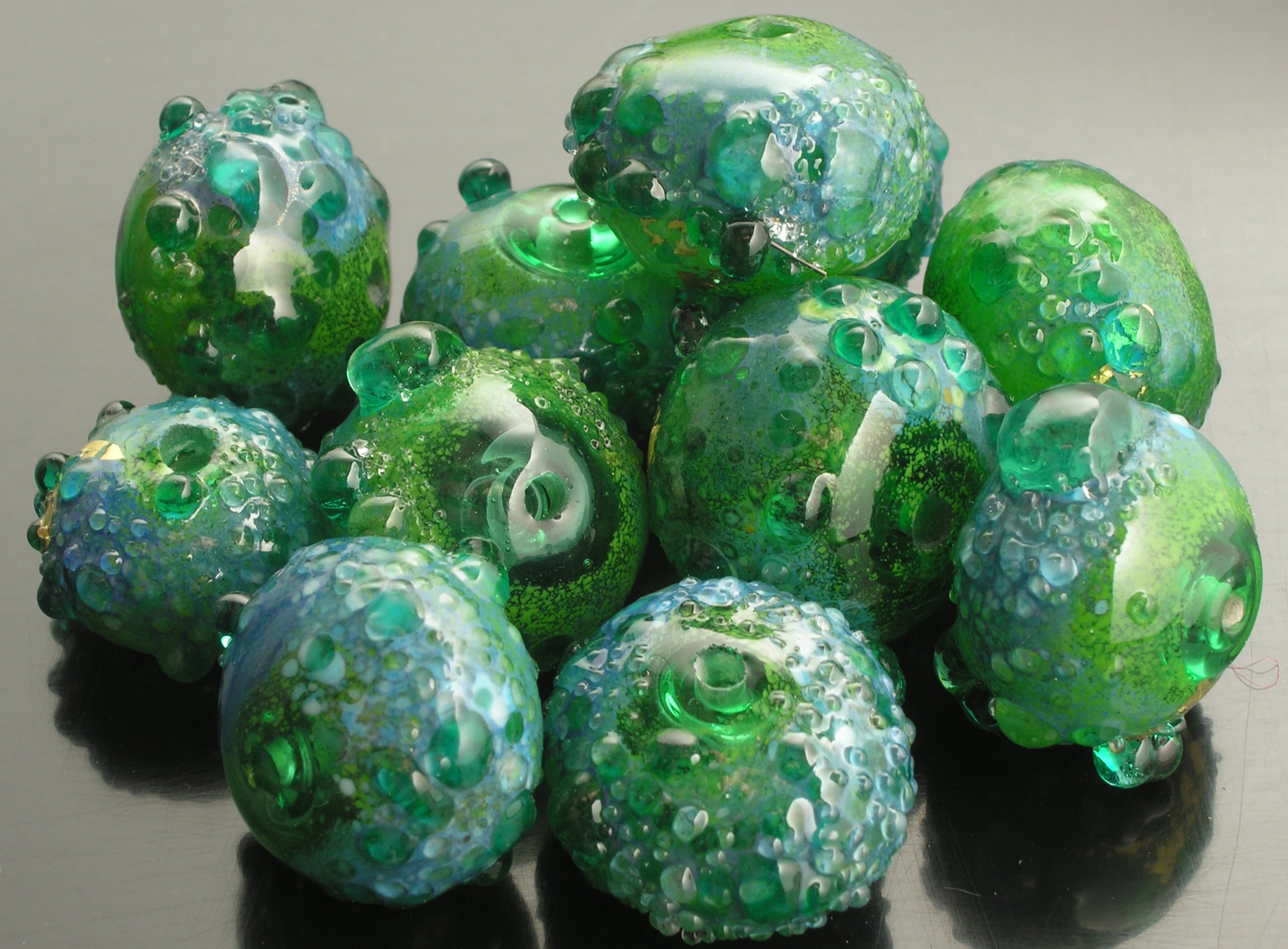
Green extravagant abstracts. May 2006
No doubt, if I were even one-tenth the programmer Knuth is I could figure out some way to put cute lil icons on the more technical parts of this post. As it happens, I think there's an even easier approach, that people automatically use—look at the pretty pix, and skip the text. As the wizard pointed out, I hardly need invite any readers I may have to do what comes naturally; this is rather an acknowledgement that, yes, parts of this post are screamingly boring, and no, I'm not taking them out: so much for amusing the average customer with personal stories. Ok, on to the post...
I have any number of early, and extremely ugly abstracts that I saved*, but eventually, after making enough ugly beads, they slowly morphed into pretty beads—at least in my opinion, and since they're my beads, I get to decide which is which. (*The fun part is that my judgement changes over time, which is why I saved these—I thought they were worthwhile. I still think this, mostly because they show how far I've come.)
One of the earliest successes was a color combo Page calls Monet Green, because it reminds her so forcibly of Monet's water lily paintings. It's basically a green bead with touches of pink and purple, even red, with black trailing but I didn't think it would be suitable.
This is an old image, but aside from the fact that I sincerely hope my proportions—both in terms of shape and color ratios—have improved, you can get a sense of my mental starting point.
It's always difficult to put into words these vague intuitions. I had a mental itch that had to be scratched, and it wasn't really till I started writing this post that I resolved that more clearly—so perhaps I'm making stuff up to explain my discomfort. With that caveat, my goals were the following:
(1) firstly to deal with obvious problems: switch from silver to gold and remove the black trailing;
(2) tighten the color scheme from almost complementary, or at least a triad (green/purple/red-pink) to one that reads as “green”.
(3) decrease the flatness/opacity to something with more transparency/ increase the bumpyness quotient.
So what about the firstly/obvious?
Well, silver dissolves (“burns off”) into glass very readily. I didn't want ugly earth-brown stains (politeness prevents me from substituting a considerably coarser term) on these—as I've mentioned before, dissolved silver can be absolutely gorgeous, but that's in subtle, tertiary color schemes, which this is not. Gold, on the other hand, stands up to heat reasonably well; I could expect it to remain on the surface (albeit in the ‘broken’ pattern) of the bead while heating it enough to partially case it in the frit I use to make the bead bumpy. (The thing to do when you need a “silver” that stands up to heating is to go with palladium or platinum—an experiment for another time...)
That same irregularly applied frit would “move” a thread-black stringer, making my trailing look erratic, like one of those sewing machine threads home-sewers despise when they get caught in the hems of their creations. Besides there'd be plenty else going on; the zing added wouldn't be needed.

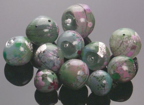
series of samples to develop new colorway. Beginning bead is leftmost.
Next: making a “green” bead:
I didn't tag these beads (I did think about it, for about 5 seconds—nah, too much work) but I think this photo is pretty close: that is, I tried some new ideas, decided they were icky, backtracked to the tried and true, then started swapping stuff out one thing at a time.
The basic manufacturing steps:
- make a chiming hollow bead out of transparent green glass
- apply TE enamels (3 layers)
- apply frits (3 layers) interleaved with gold leaf
Now I'm recreating some here, but just for kicks, let's pretend my experiments followed this sequence, which is relatively close to the truth:
1st try (at left) put apple green TE enamels on emerald green Effetre glass. This will remain the case throughout the sequence: didn't have to mess with that, thank goodness. Tried substituting cobalt blue enamel for the pink. Too contrasty. Probably used the yellow/yellow green frit that worked so well in the commemorative bead sequence, which in this case (and as it turns out, every other) barely showed. I can be just as stubborn and stupid as the next person, sometimes. Added large transparent blue-green frits. End result: a boring mess.
2nd try: Backtracked to the purple frit (which in fact is not my usual 254 based handmade, but some weird stuff the TE people were handing out, that I ground from coarse to medium-fine and then mixed in with the 254 and in any case was practically indistinguishable); still attempting to get that cobalt in there. The bead is pretty (which is as it should be, since it's a basically a Monet without the ruby clear frit and black trailing), but it doesn't ‘fit’ with my internal concept. Sigh.
3rd: At this point I had to bite the bullet: a single effort wasn't going to cut it. The base concept wasn't either, except with a lot of tweaking. Time to get on with it. Stripped out the purple frit and dark blue TE, and tried ‘bumping’ with the frit I used on the original bumpies, which, surprise, is not clear colorless but some sort of transluscent white. (Still hoping to get away without having to do much work by copying an older design.) And sho ’nuff, that's what's on the opalino pink bumpies. Again, it has potential and I even tried it on an opalino base, but not what I'm looking for. Ok, now I was ready to admit that I really was going to—horrors!—make several samples before I'd have a workable bead.
4th: Back to the green, but with clear frit. Bor-ring. (We're now to the apex of our triangle.) At this point I was definitely fixed on the yellow green/green fine frit for the base, and it wasn't contrasty enough—at any rate, we have an undistinguished green bead. But at least I was treating the necessity of trying things a little more seriously. If I'd taken better notes, I'd be able to detail exactly which TEs I was playing with; I strongly suspect beads 3 and 4 focused on narrowing this range down.
Tweaking ratios, adding depth to the color:
5th: Round about here I was starting to get a handle on the TE accent colors but, frustratingly, they're not showing up (which was more or less my reaction when I made the bead: that is, I'd been playing with these “touches” and was starting to get hints of what would work, but still needed to increase the proportion, that is, bathe bigger swatches of the beads in the TE accent colors).
Seeing the light at the end of the tunnel with regard to how I wanted to the TEs to work, I probably had come to the conclusion that no matter how much I wanted it to show up or thought it ought to, that yellow/yellow-green frit simply wasn't going to. I could've gone to a larger size (my handmade frits basically come in two sizes, large and small, a result of the screen sizes in my set of sieves) but then it would've been difficult to smooth the gold leaf over them; and the beads my customer admired have the gold leaf applied after the fine opaque frit.
So I needed something a little more visually aggressive (but not too much more) so I tried the fine sky and turquoise blue frit. That worked. Bead is still boring, but it's starting to come together. One thing my explanations don't really make clear (because I waited too long to write the explanation and can't detail all the TE experiments in the earlier beads) is that I broke this process down into chunks, and aside from detour (bead #2) of trying to do this all at once—a reaction to how icky the first bead came out, and I'm sorry to say, not at all atypical of my working methods—I more or less worked out most of the first layer (Thompson Enamels); then the next layer (opaque frits); then the big clear frits, (but I pretty much stayed with the blue-green frits: recall that the underlying goal is to make a green bead that will co-ordinate with a blue bead, so bluish green frit always made a lot of sense); and then the clear frit, which again was pretty much the choice from the get go since it defines what a bumpy abstract is, and finally the leaf (since it only really comes in two-three colors, its effect is easy to predict). In other words, I started with the factors that had the biggest impact (which in this case, but not always, correspond with the bottom-most layers) and moved to the ones with the smallest visual effect. And really, I was working only with 2 variables out of seven (TE accent colors and base frit color) which is how I managed to come up with a decent bead in so few tries:
- base bead color (transparent): emerald (vetrofond 028)
- base (rolled) thompson enamel color: kelly green 9330
- major accent (touches of) thompson enamel color: 9550, plus
- minor accents (smaller touches; pick any 2) of 9350, 9530, 9620*
- fine opaque frit: sky/turquoise blue (touches each side)
- leaf: gold (1 pc)
- coarse transparent frit: blue-green (roll; starting with leaf)
- texture frit fine clear colorless (roll aggressively)
*Hm. So did I do a pair of major accent touches, one on each side, plus 3 small touches, or 1 large and 2 small? At any rate, I tend to position touches in 3’s. (N.b. 9650 is too dark. Too bad...)
Originally I wanted a green bead, but I simply don't do monochrome well so I adjusted the thompson enamel to have touches of turquoise blue, and also substituted turquoise blue fine frit; these blue layers (which blend into each other very nicely if I do say so myself) are sandwiched between the green-base glass/base green thompson enamel and the big chunks of green transparent frit. The bead reads as green, but has enough blue in it not to be dull; the blue will also help to co-ordinate it with the blue-purple beads I need to make.
6th bead: by this point I was happy with my bead.
7th bead: discovered I had a whole more of this Vetrofond slightly less yellow, less intense transparent for the base. Figured it'd look just as good or better, plus give me the chance to make sure bead #6 wasn't a fluke.
And after that, I went into production. One down, two to go.
So, it's really not hard, broken down into steps. Yes, you can try to copy this bead (and even sell it) because no, it's not gonna look like mine. Too many variables, and they'll be seducing you down little side-paths in no time...
file originally created 18may06, completed 24may06
Unless otherwise noted, text, image and objects depicted therein copyright 1996--present sylvus tarn.