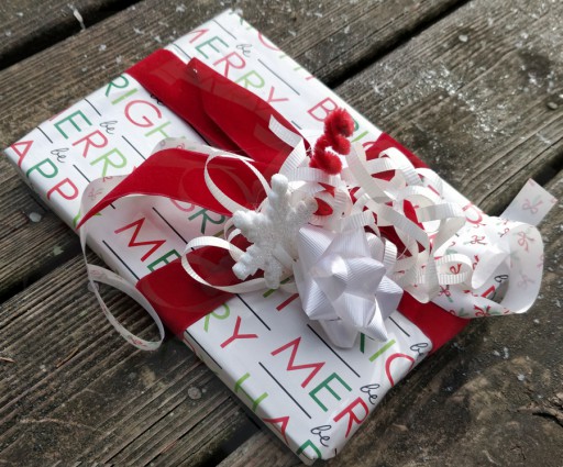
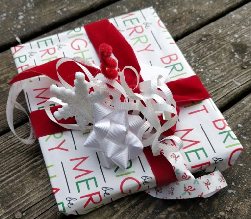
I'm kind out of practise, doing giftwrap, and this was only my second effort, so this one isn't super exciting (i.e. not my best work); but compared to the average effort, I think it's still worthwhile. I do really like the graphic quality paper, not to mention the colour scheme: lots of white with the pop of red, contrasting emerald and lime (of course...) greens, the touch of black.
I used gimp's awesome-fun unified transform tool on both these images, but it does render the views kind of the same...it's pretty paper that I don't really feel I did justice to, because the wide ribbon overpowers the delicate design (though it does cover some flaws in the paper[1] . But hey, sometimes it takes a few tries to get into the swing of things.
And it's only an ephemeral wrapping after all—it doesn't have to be perfect.
[1]Upcycling for the win...
Unless otherwise noted, text, image and objects depicted therein copyright 1996--present sylvus tarn.
Sylvus Tarn
