So I was shooting some photography for a client, and it came out crappy.[1] This of course was frustrating for me, but I realized, after I got over my initial dread, that it was just as, if not more, anxiety inducing for the poor client, who was stuck with the chore of informing me the pix sucked.
I bring this up because I detest dealing with these sorts of encounters, on the theory that it helps me, at least, to realize the other person is having just as a not-good time as me. As it happens I got a reprieve, and decided to spend some time experimenting so I would have some idea of how to fix the various problems.[2]

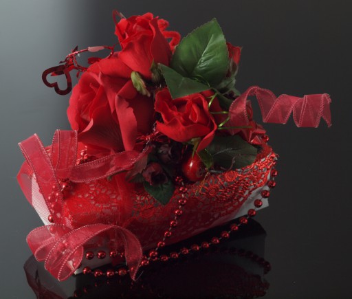
E620, zuiko 50mm macro prime, manual flash. I pointed the flash at about a 45 degree angle towards the ceiling, using both filmy and rigid white diffusing panels, the latter of which I managed to tilt ‘just right’ for the gradation.[3] Obviously used a mirror on the right side to bounce some light into that lower right corner.
This is one of about 20 shots I took of a gift from my glass buddy Frances.[4] It seems really obvious, but without darks and shadows, sculptural objects such as this look flat and boring. (I s'pose I should've saved one of the mediocre shots.) I chose this image because the shadows in the largest rose really light it dramatically, drawing the eye to what is actually supposed to be the focal. At the same time the shadows the large leaf are nice and soft, the ribbon and particularly the foil lace (on the right) are nicely highlighted, which keep the eye from zooming off the edge.

Here's the back corner. Foil lace, nylon netting, mylar wrapped curling wire, ribbon, silk roses[5] & leaves, bows (plastic apple & bow ornaments not in view) hot glued to white box. 1jun2016
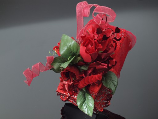
Another 20 odd shots later, we have the backside. Here I was playing a bit with the flash's focusing (which I still don't really understand) and getting a graded background. This picture doesn't have the same quality as above, since the focal rose doesn't have adequate contrast, but then, I was getting tired. Photography is surprisingly difficult work for merely pushing a button!
Checklist for pix:
- Wipe down black plexi to remove dust. N.b. images will always look better if light is reflecting off of it at a pretty acute angle, which hides dust & imperfections.
- Be sure to use manual white balance rather than flash setting if using diffusion material; it gives a brownish cast. N.b., Modeling light does NOT affect colour.
- Tip background up slightly (as for these pix here)
[1]Mostly from being out of practice.
[2]Well, not styling stuff upside down, obviously....
[3]Some day I will learn how to do this properly.
[4]I don't know that red is her favourite colour. But she certainly likes it.
[5]The focal doesn't pop. This is where the lensbaby comes in so handy, that point focus forces the viewer to look where you want them to.
Unless otherwise noted, text, image and objects depicted therein copyright 1996--present sylvus tarn.
Sylvus Tarn