For quite a long time I've had this little strip of fabric ribbon, in sort of a country-craft, in a muted orangey pinkish brown, with a country print and coarse edging—the sort of thing that was, back in the ...90s? everywhere during the ‘country craft’ rage. Mocking me with its ugliness.
Anybody remember that? When sunbonnet sues, dusty rose and blue slate and cutesy lil quilts and other soft furnishing were everywhere, and horrible?

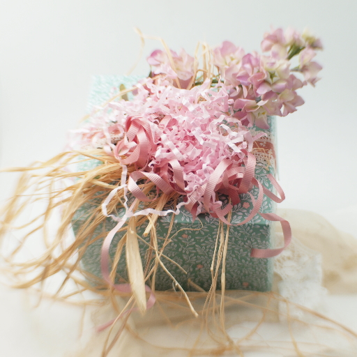
Giftwrap: raffia, pink crinkle ‘filling’, silk flower spray, fabric ribbon, curling ribbon. Once again, photographed on the ‘romantic’ lace background with the lensbaby sweet35, thereby strengthening the overall aesthetic, though this time I (gasp!) actually increased the f-stop above its lowest setting, which still leaves plenty of blur around the perimeter.
It was everywhere, back when I was doing art fairs. I loathed ‘country crafty’ with a red hot passion, because it was so hideously bad. Eventually, it merged (or was replaced by) shabby chic (which I adore) and some time after that, years after it had mercifully faded from my consciousness I stumbled across an essay explaining that the original country craft was actually quite handsome and clean in its aesthetics, which iirc[1] probably inspired by colonial craft in general and Shaker aesthetics in particular.
Oh, I thought. That's not so bad.[2]
So here's my take, and the interesting thing (to me, anyway) was how completely accidentally it happened: I found a piece of wrapping paper that was a pretty good size (i.e. only half an inch too short, so no cutting, or worse, waste) that was not christmasy (as probably 75% of my papers are.) If you look closely, you can see the design is simple floral, but kept from getting too sweet by the little ball end thingies sticking out of the leaves, and the fact that the stamens are represented by sort of a V shape, rather than the more obvious (and boring) circle you might expect.
And that horrid brown ribbon was perfect for covering up the gap in the paper! I had a spray of silk flowers lying about in a good color, some nice dusty rose curling ribbon, and raffia—which all came together rapidly with the addition of crinkle pink paper stuffing.
This was one of those projects that just clicked, and so I was very happy with it. (Why yes, today's beads were mostly awful, why do you ask?) Which just goes to show, a given component can be dull or even downright ugly on its own, but put with the right stuff, looks fabulous. This is, to my mind, the genius behind doing collage or other mixed-media craft well, and I fail at it often enough to have a pretty good idea just how difficult it really is to do well. (Good bead-stringing or really any kind of assemblage requires this kind of thinking, really.)
Even if it is country craft pink and blue:)
[1]And I often don't—this whole diatribe is merely my interpretation of half-forgotten memories of imperfectly understood things to begin with.
[2]I wonder if the success of Little House on the Prairie, or the rise of Fundementalist/Homeschooling movement—I've been reading a lot of Libby Anne lately—had something to do with the rise of ‘country craft’? In any event, I think it got taken over by suburbanites with a nostalgia for a slower, simpler (but hella harder) time, and given the complete disconnect between them and the rural life of the 1800s, it's easy to understand how the original guiding principles (functionality being a major one) would get lost.
Unless otherwise noted, text, image and objects depicted therein copyright 1996--present sylvus tarn.
Sylvus Tarn